Life in black and white
Of course, life isn’t black-and-white – it’s a myriad of vibrant, dancing colours which photography helps to portray in everyday life, in journalism and in art.
Ridley-Scott once said “Life isn’t black-and-white. It’s a million grey areas, don’t you find”.
I was covering a conference recently with a good friend and long-time client when I mentioned that some of the shots that we had taken at the conference would look fantastic in black-and-white.
He is a hard-bitten, seasoned journalist and curtly told me that he wasn’t that keen on black and white as it has no place in today’s publishing space.
Indeed, it’s something we never do. We never publish black-and-white photographs in our very highly polished news magazines and journals. It simply doesn’t work. We are journalists and we are there to provide information.
Information is in colour – black and white is a man-made thing.
Of course, when the photography world was first born, black and white was the limitation of the science. But the events that were captured were simply turned into black-and-white from a colour scene.
So, as the first blog from the new BillyPix website it might be interesting to examine whether black-and-white photography still has any relevance.
Some of the photographs used here in this blog were published in colour because the magazines that commissioned them, of course, ran in full colour and look fantastic as such.
But sometimes, just for the sheer pleasure, it’s fun to look at them as monochrome.
So, in Ridley-Scott’s million areas of grey, there is a different tonality and a feel that evokes a certain beauty.
Photography was invented almost 200 years ago – so in this much improved science we have at our fingertip why would we want to look at photographs in black and white anymore?
My bible when I was learning my trade was a book called “Pictures on a Page” by the great Times editor, Harold Evans. And some of the photographs in that book I still think of today as benchmarks in what we, here at BillyPix, try to achieve for our clients every day in every assignment.
But of course, Evans only had black-and-white photographs to use in the book because, up until the mid 1980s, newspapers were still using linotype machines which could only reproduce photographs in black-and-white.
And even when Eddie Shah launched Today, the first full colour newspaper in the UK, the colour wasn’t that great, and monochrome was still used in most provincial newspapers such as the one where I cut my teeth. I’m afraid I really am that old, and I can tell you I do not miss the hours fighting the chemical fumes in our dodgy old darkroom.
The newspapers and magazines for whom BillyPix tends to work most have to reflect reality.
We are journalists, we are telling a story therefore colour must be the only way to go.
Even some of our more seasoned photographers still doubt the technical, aesthetic or artistic justification for black-and-white over colour.
I would argue that they are right when we are publishing news content. It would be different if we were shooting advertising pictures, which we generally don’t.
So now black-and-white is a purely man made medium which is where I think it lends to the more artistic approaches to photography. Colour is literally informative which is not to argue colour pictures cannot be regarded art. Clearly there are some stunning colour photographs that take my breath every day and I wouldn’t argue against those for a minute. But when we are discussing black-and-white photography it might be worth looking at some of these that BillyPix photographers have taken recently to give them a monochrome outing.
There are those who would argue in lofty, artistic terms that black-and-white photography has more atmosphere, more soul, and it may reveal the true essence of things if colour is removed. I have read that some say “one looks at the colour photograph, but one looks into a black-and-white photograph”
I’m not sure I necessarily agree with that. I don’t have the intellectual capacity or the artistic credentials to argue either way. I just know that sometimes it looks right, and it feels right.
But it’s only on platforms like, this when we can discuss the merits of either, that any of our photographs would ever get any airing as monochrome.
For example, this shot, taken at a networking event at a Latin Americas airline industry conference, was used in a DPS (double page spread) in the daily newspaper we produced at the event. The event was in Nassau, Bahamas – one of the most colourful and vibrant places we have ever worked – and yet this just works better as b/w.

Or these, essentially straight forward conference pictures taken at airline leaders forums in The Middle-East and Africa, where life is given to the images by taking away the colour.


Or this of an BT engineer in Scotland who volunteers BT’s emergency response team.

And this from an aviation industry exhibition hall.

And spontaneous news events also hold a certain power in monochrome too.
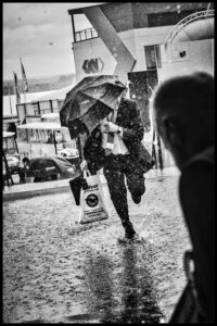
This image was featured as our splash shot during a downpour at a Farnborough Air Show.
Of course, we carried it in colour and it was fantastic – no question about that. But again, stripping the colour away leaves a striking image that holds the gaze just a little longer.
Hi, this is a comment.
To delete a comment, just log in and view the post's comments. There you will have the option to edit or delete them.
Black and white is timeless….. colour I always thinks dates …